Logos are not a modern phenomenon - we have been identifying and differentiating ourselves and our enterprises using images and emblems for hundreds, even thousands of years[1]. While the technologies we can use to create and showcase our logos have developed drastically over time, the reasons we create them have remained relatively consistent. Logos are unique identifiers - a way to quickly and concisely share something of your brand – perhaps its activities, or its values. This blog shares the findings of a rudimentary visual analysis of a number of charity logos, explores the potential pitfalls of rebranding, and weighs up where a logo fits in the overall brand of a charity. We would like to thank Michele Madden (our former Director) for instigating the logo analysis.
Is there a ‘typical’ charity logo?
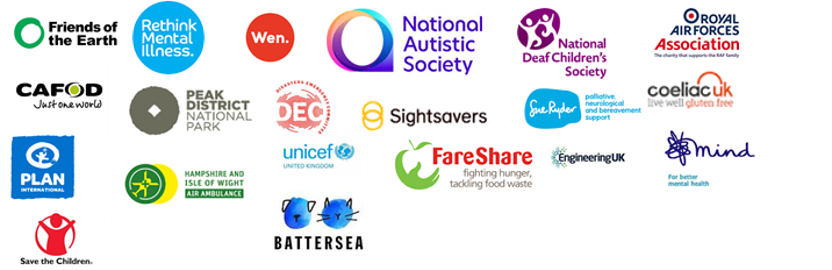
Just as it cannot be said that there is a ‘typical’ charity[2], it is hard to say that there is a typical charity logo – although a fair few do share similarities, regardless of cause. Circles (and derivatives of circles) are the most popular shape that we’ve identified within charity logos. The composite image below shows a few logos from charities featuring circular shapes:
There is plenty to read on the internet about the symbolic meaning of circles; some popular narratives include that they represent wholeness, eternity, or the cyclical nature of things. Whatever you choose to read into circular shapes (esoteric or otherwise), circles form a good basis on which other shapes and narratives can be built.
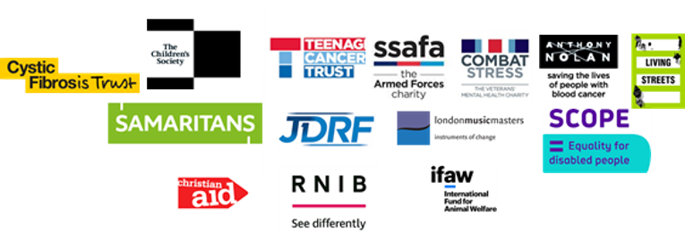
The second most popular shape that we’ve identified in charity logos are lines (and derivatives of lines):
Where the circle might represent something whole with no beginning or end, a line might represent something with a definite start and end point. Think of all the idioms or phrases which feature lines: “they’ve crossed the line”; “I’m drawing a line under this”; “a line in the sand”; “there is a fine line between x and y”… Lines allow for demarcation; they convey something of finality or certainty.
Some charities tell a more specific story with their logo through the use of people or animal shapes. We’ve found that animals feature more frequently than people in logos:
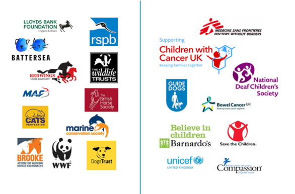
You don’t have to be an animal charity or non-profit organisation to feature an animal in your logo (see Lloyds Bank Foundation and MAF logos above) – but as you might expect, the majority who have made this stylistic choice are animal (or at least animal adjacent) causes.
Out of the logos above featuring people or people-like shapes, it is interesting to note that the majority are children’s charities.
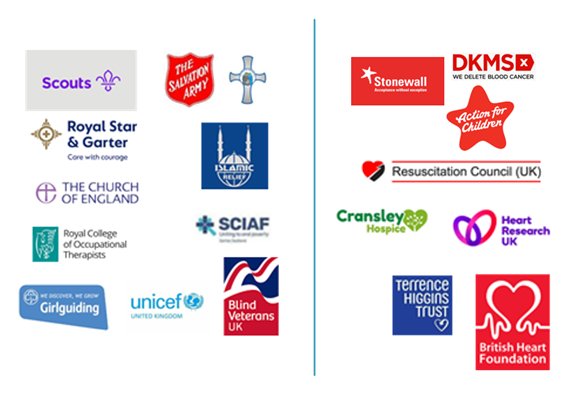
From what we can see, badges and symbols outnumber hearts and stars. Badges and symbols (such as the Christian cross or Scouts logo below) may signify a more traditional brand, perhaps with a history spanning back further in time. Hearts have been used in logos literally to connote heart health related causes, or symbolically to convey something of love and care.
The significance of colour
From the images above, you may notice that some colours feature more strongly than others. Different shades of red and blue feature most prominently; however, there is a fair bit of green, yellow, and black present too. Through this process, we discovered that very few charity logos feature brown.
There is much in pop psychology about the way colours impress upon us and affect our moods. Red is commonly associated with passion, urgency, and action[3], so it is perhaps unsurprising that it should be the colour of choice for so many charity logos. Blue, on the other hand, is a colour associated with calm, reassurance, and comfort – again, these are desirable qualities that some charities may want to embody through their logo.
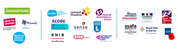
Military charities commonly make use of blue and red in combination in their logos, often making clear reference to the flag of Great Britain. This motif works for these causes as the flag conjures up traditional and patriotic values, which many military charities may seek to embody. However, this straightforward stylistic choice has made logo differentiation a little bit of a challenge in this sector. In the composite image below, compare how similar a number of military charity logos are with the logos of some selected mental health and disability charities:
Taglines in logos
Some well-established or popular charity brands have the advantage of instant recognisability and an understanding of what they do amongst the general public, just from their name or logo. Choosing to include a strapline in a logo is a potential way for charities to make their aims and identity clear if their name doesn’t already reflect that. Charities with acronyms or those named after historical figures may be at risk of people not knowing who they are or what they do, particularly amongst younger generations who may not grow up with the same reference points as their parents.
We tracked the awareness of a charity brand before and after they rebranded to include a strapline in their logo. Awareness of them amongst the general public almost doubled in just over one year (having remained consistently low for 4 years prior) following a logo change to include a strapline.
To rebrand or not to rebrand?
There are many reasons why a charity might choose to change its logo. These include staying current/keeping up with the times; reflecting new goals or ideals; differentiating themselves from other charities and connecting with a new audience.
It is to be expected that it might take a bit of time for a new logo to embed itself in the public psyche and become recognisable and attributable to a particular organisation. Through our Charity Awareness Monitor research, we have helped a number of charities working in a range of different causes to track how changing their logo has affected the public’s perception of them. We’ve experienced rebrands where a new logo has increased the prompted awareness of a charity (best case scenario), and where the opposite has happened, even after the logo has had time to become established (worst case scenario).
We feel that it is important for charities to approach rebrands from an informed place, taking into account the views of supporters and key stakeholders. While a new logo might result in traction with a new audience, it is important not to alienate or confuse your existing audience with your new visual identity. Although not a charity, the recent rebrand of Investment house Standard Life Aberdeen to ‘Abrdn’ has invited widespread ridicule with some people feeling the new name isn’t clearly pronounceable, and resembles a typo[4]. This serves as a good example perhaps of what not to do in a rebrand.
If you’re thinking of rebranding, some key questions from this blog which you might want to reflect on in relation to your own charity logo are:
- Does it stand out in the crowd?
- Does it convey something of your charity's work (e.g. pictures of animals, or a strapline) and, crucially, does it need to?
- Does it give an impression of your charity? (e.g. warm, caring, vibrant)
- Does it look up to date? Does it work online and with online colours?
Logos - the tip of the iceberg
A charity’s logo and visual identity is like the tip of an iceberg, with the true bulk of what makes a charity lying beneath the surface. We feel that a strong charity brand comes from strong and clear beliefs and values. It is important for a logo to represent a charity well, but it cannot do all the work of making a charity brand. We have shared lots of free findings from our brand research in blogs including:
- What our research reveals about two of the most successful charity brands of 2020
- The brand of charities: the paradox of the pandemic
- Key findings from our research of charity brands
- Four ways to raise your charity’s profile
- The recipe for attention-grabbing messages: TURF analysis
[1] The history of logos - https://99designs.co.uk/blog/design-history-movements/the-history-of-lo…
[2] Just my Type Report – nfpSynergy - https://nfpsynergy.net/free-report/just-my-type-archetype-analysis-char…
[3] How 8 Colors Got Their Symbolic Meanings - https://www.livescience.com/33523-color-symbolism-meanings.html
[4] Abrdn: Standard Life Aberdeen vowel-less rebrand mocked - https://www.bbc.co.uk/news/business-56888611
Hello, I agree with your
Hello, I agree with your point on military charities using the same colours - but the military charities use blue and red to denote the different services - Army is red, Navy is dark blue, RAF is light blue. They are referred to as the Tri colours for the Tri-Services.