
A tangled web: Ten ways the Charity Commission website makes charity finances less transparent
It would be easy to imagine that the Charity Commission would be the best and most accurate place to look for information about a charity’s finances. After all they have a statutory duty to improve public trust and invest substantial amounts in the information they provide about charities on their website.
Unfortunately, the Charity Commission website in many ways does the opposite. It provides misleading or confusing data about how much charities spend on their fundraising and trading activities. It also misleads, misattributes, muddles, or makes charity finances less transparent in a range of significant ways. Download this report below to see what our research found.
Problems 1 and 2: fundraising and trading costs disappear in the Charity Commission pie charts.
The first two problems with the main Charity Commission website which sets out the financial details of charities is that the expenditure pie chart doesn’t show the expenditure on fundraising or trading activities in it. So if you search for the details of the NSPCC (all the charities illustrated in these examples are purely incidental) it shows a voluntary income of £103.9 million but no expenditure on ‘generating voluntary income’ (see the red square around the £0 figure).
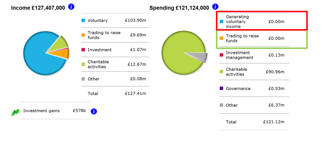
The same is true for trading costs (see the green square about the trading figure of £0m.) Maybe this is because NSPCC doesn’t spend any money on fundraising or trading? Sadly not. The summary bar chart in figure 2 shows something rather different. NSPCC actually spend around £30 million on generating voluntary income as the screen grab below shows. The full accounts break this down to be £23 million on fundraising and £4.5 million on trading.
(All the images in this piece are taken on Firefox, but Chrome and Explorer have the same problems which recur on all sorts of different charities figures as well.)
Problem 3: the pie charts show a skewed picture of charitable expenditure.
Another problem that arises from missing out the data on ‘generating voluntary income’ and ‘trading to raise funds’: its skews the pie chart and makes it looks like the charity in question (NSPCC in this case) spends a higher percentage of its expenditure on charitable activities than is really the case. This is the maths from missing out a slice of the figures making the remaining figures appear a higher percentage.
Problem 4: the bar charts combine fundraising and trading costs and then appear to attribute them to fundraising.
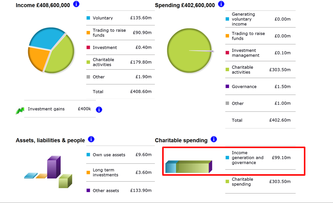
The next problem is that the website bar charts combine costs for fundraising and trading and lump them together in a single figure which has the same colour as voluntary income. So if you look at a charity like Oxfam which has fundraising and trading (mostly shop) income, it has fundraising and trading costs. As problems 1 and 2 show these aren’t visible on figure 3 below. So it’s only through the bar chart that a donor can work out what the cost of generating income might be. The bar chart for Oxfam has the total cost for raising funds at £99 million (see the red rectangle on figure 3). Given that it’s the same colour as ‘voluntary’ income it would be easy to imagine that Oxfam has terrible fundraising figures ie spending £99 million to raise £135.6 million. In fact, Oxfam spends a respectable £23 million on fundraising and £70-odd million on trading, which is also respectable, but it takes a fair amount of looking at the full accounts to discover that.
Problem 5: the pie charts attribute trading costs to ‘other’ (sometimes)
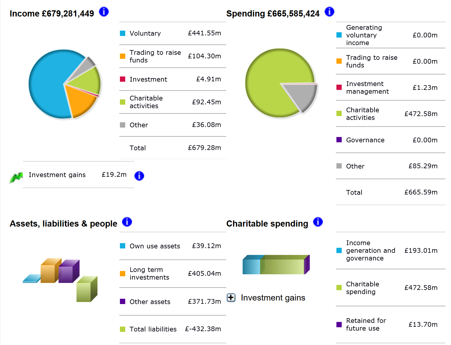
Unfortunately, the Charity Commission is inconsistent in its attribution of costs as well. The costs of trading and fundraising should be in the pie slices labelled as shown in figure 4 for Cancer Research UK (CRUK). So CRUK shows a healthy income from both voluntary income and trading and a lack of any costs for those items. Again, a brilliant performance were it true. Wait a minute though; what is the big grey pie slice for £85 million of costs in the category ‘other’? It can’t be the trading expenditure because there is a pie slice specially for that expenditure category. A quick look at the full CRUK account reveal that it is in fact exactly that – shop costs of £85 million. It is one thing to miss out costs altogether, and another to attribute them to something completely different from the category where they belong. It is quite possible this is a data entry problem, but it is nonetheless very misleading. Equally confusing is that the total cost in the ‘income generation and governance’ bar is right, even though the pie chart slices are wrong.
I told the Charity Commission about the first of these problems in December of last year, and more recently in July. Their response has been that the Beta website is coming and that will prove the solution to all the problems of the fundraising costs not showing up. Well 9 months later the Beta site is still the Beta site. It is not clear whether the statement on the landing paper of a charity’s search is in fact alluding to the fact that their data is misleading when it says ‘if the financial information below is for 2016 or 2017 it may contain some inaccuracies. For the most up to date information use our Beta service’.
So how is the Beta site? (http://beta.charitycommission.gov.uk/) Well it certainly is no better on all but the first of these problems, and it adds in some new problems all of its own, outlined below.
Problem 6: The Beta website makes it harder to find key information
While when you go to the main alpha Charity Commission search function you get a screen that summarises the main finances of a charity (misleading as it is), on the Beta site you get next to no useful information as figure 5 below shows for CRUK. So to get to the same info as the alpha site it’s necessary to click on financials or one of the other tabs. Not a big deal, but every extra click is an extra barrier for some website users, and a slight reduction in transparency.
Problem 7: The Beta website misleads with its use of pie chart colours.
Once you get to the main pie charts on financials there are three problems as figure 6 illustrates.
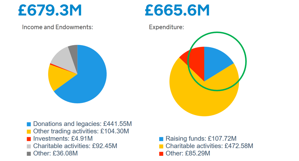
One of the basics that we teach our research assistants is that colours and other use of formats and icons are really important to help people understand data. Colour is a key part of that. What figure 6 shows is that while the blue for income is consistent, the colour mustard is used in trading activities income, and then is used for charitable activities expenditure. Totally misleading. The same is true for the red of investments on income and ‘other’ on expenditure (which we now know is actually trading expenditure from figure 4 in the case of CRUK.). We shouldn’t overlook one small piece of good news: the generating voluntary income slice is now populated (see the green circle in figure 6), even if the trading slice isn’t because it no longer exists!
Problems 8 and 9. The Beta website doesn’t even have a pie slice for trading costs, investment management or governance.
Figure 6 illustrates more problems. The first is that the Beta website doesn’t even appear to have a pie chart slice available for trading expenditure. So while figures 1 and 4 show that in the alpha search there is a pie slice available for trading expenditure, even if not populated correctly, it’s not possible to get this information on the beta site as figure 6 shows. There is also no longer a pie slice for expenditure on ‘investment’ which there is on the alpha site. Nor one for governance.
This is undoubtedly a backwards step, because of course the return on investment for fundraising and trading are completely different: trading is lower than fundraising. So lump them together and its makes fundraising costs appear much worse (though if you remember, what actually is happening is that the trading costs are being allocated to ‘other’). The lack of an investment management pie slice means in the alpha website Trust for London spends £1.3 million on investment management, and in the beta website that has become £1.3 million on ‘raising funds’. Dear oh dear.
Problem 10: The Beta website use of titles is really unhelpful
Along with pie chart slices reduction and poor use of colour, the beta site also manages to embed confusion by labelling things in a misleading way. The new title for ‘voluntary’ is ‘donations and legacies’, and while neither title is great, the new title implies that this income is in fact donations from the public. But of course it isn’t. It’s all income treated as voluntary and this includes grants, including government grants. A good example of this is the British Council. They get negligible public donations. What they do get is a big grant from the Foreign Office. So when their beta site pie chart says ‘donations and legacies’ of £158 million a big chunk of that will be the Foreign Office grant. The same applies to Teach First which has a ‘donations and legacies’ income of £16.71 million. Drill into the accounts and on page 34 it’s clear that £7.2 million of that is a grant from government. I wonder how many people who work in charities might realise a government grant is a ‘donation’, let alone members of the public. So it’s a deeply misleading title.
Why does all this matter?
This litany of inaccuracy, mislabelling, mistakes and misattribution is bad news. It’s bad news because the Charity Commission’s Chair has said that building public trust is her number one goal. And if the public can’t trust the Charity Commission to produce accurate, transparent and easily accessible information, who can they trust?
One answer is not charities themselves –at least not on their websites. While they have to produce very detailed and specific information in their annual report and accounts they don’t have any regulation or specification on what they can produce on their website.
The Charity Commission should be a role model for producing accurate information about how charities raise and spend their money, in a way that our research at nfpSynergy shows that the public crave. As it stands at the moment, the Charity Commission website is part of the problem, not part of the solution, in giving donors and the public accurate information about charity finances. The good news is that these problems don’t appear to be about cost, or due to budget cuts. They should be relatively low-cost to change and rectify. However, it is vital that this happens so that the public can rely on the Charity Commission search functions provides donors and the public with accurate and insightful information into an individual charity’s finances.
Joe Saxton and the nfpSynergy team
For further information about this report please contact Joe Saxton on joe.saxton@nfpsynergy.net
I wonder how long the Charity
I wonder how long the Charity Commission is planning to keep two sites going? The general public will undoubtedly come across the Alpha site, which is terrible. The Beta site is a big improvement, but still has some way to go. I'd also like to see the Charity Commission change the criteria for financial reporting, because at the moment it's based on income, which means that some grantmakers that had a large endowment and are spending hundreds of thousands giving grants to charities, don't actually have to file public accounts, which is very bad for transparency amongst grantmakers. Lots of room for improvement!
Great piece of analysis -
Great piece of analysis - well done. We need better transparency , especially from the Charity Commission.
I also have concerns about
I also have concerns about the beta site. We have lost the possibility of searching by post code. In addition when searching by a key word the charities are listed haphazardly, not in the alphabetical order do the old site.
Clearly the commission's site
Clearly the commission's site has some way to go. In the end, there is no easy substitute for looking at the charity's full accounts. These, however, can be a bit of a puzzle. What would be really useful would be an idiot's guide from the commission (or nfpSynergy) on how to interpret charity accounts and the various tricks contained therein...
I think this blog is a very
I think this blog is a very helpful steer – and ultimately it is about making charity financial information easy to understand and accessible - which is very important.
It would appear that since publication of this blog the pie charts have been withdrawn from the website – so for charts we have to go to the beta site. I agree that using common colours for like items would be better and also that it is important to include pie slices for trading. [I am less convinced it is vital for governance now that this is included within charitable expenditure in the Statement of Financial Activities.
I think the title “donations and legacies” is a more tricky issue. I assume this change from voluntary income is to mirror the change from Sorp 2005 to Sorp 2015 and so on that level it is correct to change it. However I agree that SORP Committee should look at this because the definition of donations and grants includes “grants of a general nature provided by government and charitable foundations which are not conditional on delivering certain levels or volumes of a service or supply of charitable goods.” This is problematic because:-
- As you say – how many people realise that donations and grants can include government grants
- I think there is inconsistency in the sector in terms of whether grants that are not conditional on levels / volumes are being shown as donations and legacies or as charitable activities
- The phrase ‘grants of a general nature’ is confusing because I think it means general in terms of not performance related rather than general in terms of unrestricted.
I think an important service is delivered to the sector with this contribution – well done.
Nothing new! The Charity
Nothing new! The Charity Commission is a paper tiger and whilst Parliament and the Insolvency Regulator have produced damning reports on the conduct of the Trustees, CEO and Chair of the board of Keeping Kids company Ltd, the Charity Commission the REGUALTOR of charities have done nothing; not even an interim report! They are worse than useless and next year they intend to charge larger charities a fee in order to fund the Commission's work. If THAT isn't a Conflict of Interest then I don't know what is!!!
Add new comment