
We recently carried out three focus groups with charity-friendly members of the public (55+ year olds, 35-54 year olds, and 20-34 year olds) to gauge their thoughts on a range of issues regarding charity reporting.
A few key themes emerged; just knowing that charities were regulated reassured the 20-34 and 35-54 groups, and it was agreed across the board that few would look for the detail or read all the detail in charity financial reports. There was an appetite for summary information, simply presented statistics (e.g. pie charts) and other alternative ways of presenting information. The 55+ group agreed that annual reports, when done well, can change people’s minds about a particular charity. This blog gives a snapshot of these issues as they were discussed in the focus groups.
*
The 20-34 and 35-54 age group focus groups expressed contentment with the idea of an accredited external regulatory body reviewing charity finances so that they wouldn’t feel the need to do so themselves. This sentiment stems from uncertainty about how honest charities are, and a difficulty in understanding financial reports:
Female, 20-34: “[…] I am actually thinking now, all the stuff they say, do we know it’s still true? Is it being checked? […]”
Male, 20-34: “[…] It is reassuring when you hear that some kind of external body, auditors who have been involved in checking up on the figures”
Female, 20-34: “Maybe it should say ‘this has been verified by…’”
Participants across all age groups stated that they were extremely unlikely to read through full charity financial reports as they currently exist, and that to do so would be difficult. This is due to the level of detail contained within average financial reports, and contributes to the idea that charities are unclear about what donations are spent on.
Female, 35-54: “…life is too short. I don’t have enough time to live at this point, let alone take on annual reports from charities”
Male, 20-34: “I wouldn’t read it at all. I would have to like really be searching for [something] to find it and I just don’t think I would search for it”
Male, 55+: “I am used to looking at balance sheets, maybe other people aren’t, I probably think it’s a little too detailed, you just go to the last page”
Male, 35-54: “I used to read these [financial reports] for a living. Not [for] charities but for companies I have worked for and I think they’re quite difficult to navigate to be honest”
Our Charity Awareness Monitor research reveals that the public rank transparency on spending as the main factor that would encourage them to give.
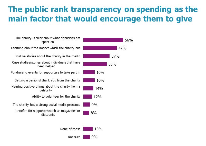
Figure 1: Factors which would encourage people to give to charity.
Base: 1,000 adults 16+, Britain | Source: Charity Awareness Monitor, Jul 16, nfpSynergy
A clear way for charities to be forthright about what donations are spent on and demonstrate their impact would be through concise summary information of their accounts.
As well as ranking transparency on spending as the main factor that would encourage them to give, a significant proportion of the public agree that charities not being clear on how donations are spent is a significant barrier to giving:
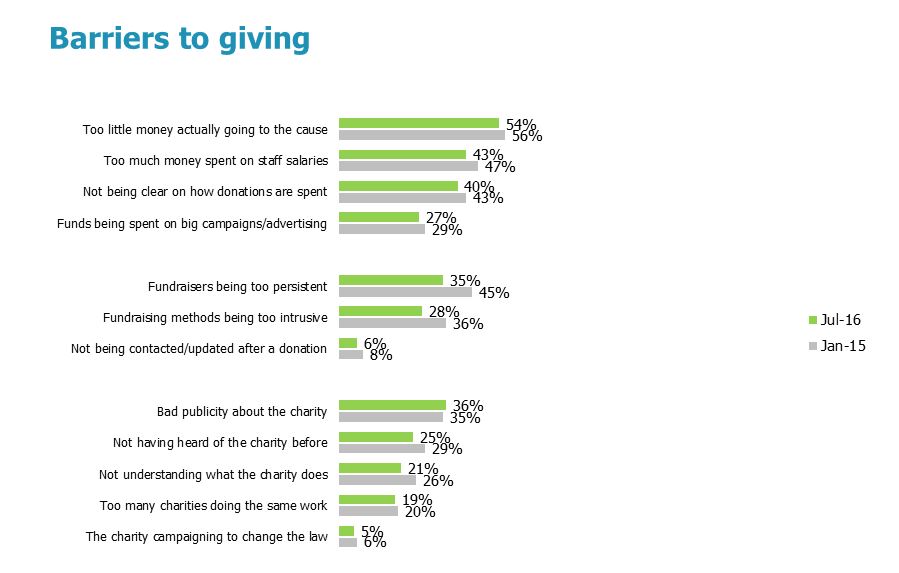
Figure 2: Barriers to giving to charity.
Base: 1,000 adults 16+, Britain | Source: Charity Awareness Monitor, Jul 16, nfpSynergy
The need for charities to better present their finances to the public and some ways they might go about this were discussed by all age groups. Suggestions included ‘headline’ figures, pi-charts, simpler terminology and other alternative ways to present the information (e.g. YouTube clips):
Male, 55+: “Right, this is […] a huge document, and it has got lots of things that would interest people who are sophisticated enough to read this and understand what it’s all about. But I think they need a half way thing which is kind of like the synopsis, that is on a page”
Male, 55+: “Well, it’s consolidating the information, making it more concise and understandable […]”
Male, 35-54: “Well, they’re welcome to have a supplement aren’t they? Not necessarily replace the annual report, for someone who wants to know about it in detail, but…”
Female, 20-34: “I would definitely read [a summary]. Definitely wouldn’t be opposed to that […]”
Male, 55+: “It’s like if I read a newspaper article, I look at the headline figure, the strap[line], and then I decide if I’m going to drill down into it”
Female, 34-55: “…I like the terminology, “how we use your money””
Female, 20-34: “…I would be happy just with the pie chart to be honest. I would trust the… I would just think that they can’t lie […] I feel like someone somewhere is going to check that right”
Male, 55+: “They could actually send [a pi-chart] and then [say] for further information on these percentages, please go to our website. End of”
Male, 20-34: “If it was clear it was meant to be read rather than to confuse you so you don’t read it which is what a lot of numbers and words would make me feel like…”
Female, 20-34: “I would have the report but if I was to publish it out there I would have like a YouTube clip or something for one of your videos, like 10 seconds and say that is what we have, click here for more information…”
Male, 55+: "I think all they need is a Pi-Chart”
Some examples of charity annual reports were shared. While looking at the Haven House annual report, two participants from the 34-55 group shared this exchange:
Male, 34-55: “I like the way they’ve done it though in terms of the colour and the use of pictures”
Female, 34-55: “Yeah, it’s engaging”
The Haven House annual report begins with a summary of their spending and impact, complete with colourful icons and images. There are also colourful pi-charts and graphs interspersed through the rest of the report, and a ‘House of Care’ diagram summarising the hospice’s activities and goal.
Members of the 55+ age group focus group expressed positive sentiments towards Shelter’s annual report which they perceived to be done well:
Female, 55+: “[…] It’s quite good because they have broken it up with lots of pictures[…]”
Male, 55+: “Absolutely, it’s almost making me want to support Shelter to be honest with you”
Female 55+: “[…] I think it is excellent, what I’ve read, what they’re doing”
Male, 55+: “Yes, it’s all there […] whether you understand it, or you don’t understand it”
Shelter’s annual report also makes an effort to present information in a user friendly way with lots of images and varied text size.
The 55+ group joked about the possibility of ‘a GoCompare for charities’[1] if charities or the public began to focus too heavily on reporting. Although this seems like a ridiculous idea, they acknowledged that changes in the charity world are affecting public sentiment and bolstering the need for transparency:
Male, 55+: “[…] maybe 20 years ago you didn’t see chuggers[2] and that’s why people do really want more transparency now.”
Three things we conclude having listened to the donors:
1. The public are reassured just by knowing about auditors and Charity Commission regulation.
While few charities make a point of telling donors and stakeholders they should say again and again that their accounts are audited, and their work is regulated by the Charity Commission (and a bunch of other regulators). Just tell them!
2. While the public are impressed by full annual reports, most admit they need summary information.
The public liked the full report from Shelter, but most admitted they would never look at it. So the introduction of a concise summary page in charity annual reports was welcomed and encouraged across the board. This is why we have promoted and supported the introduction of a ‘key facts’ into annual accounts through SORP.
3. There is a thirst for simple stats like pie charts and infographics to make the message easier to get across.
We never knew there was such a love of pie charts amongst donors. The infographics of Haven House were also much loved. Charities should never forget that less is more, when it comes to getting the message across.
You can download a document containing verbatim quotes from the focus groups here, or use the purple download manager located beneath the 'share this resource' social buttons. Scroll down further if you would like to leave a comment too!
[1] Female, 55+: “We are probably gonna get a GoCompare for charities at some stage[…]”
[2] “Chugger: a person who approaches passers-by in the street asking for subscriptions or donations to a particular charity” Google, 2017 [https://www.google.co.uk/search?q=define+chuggers]